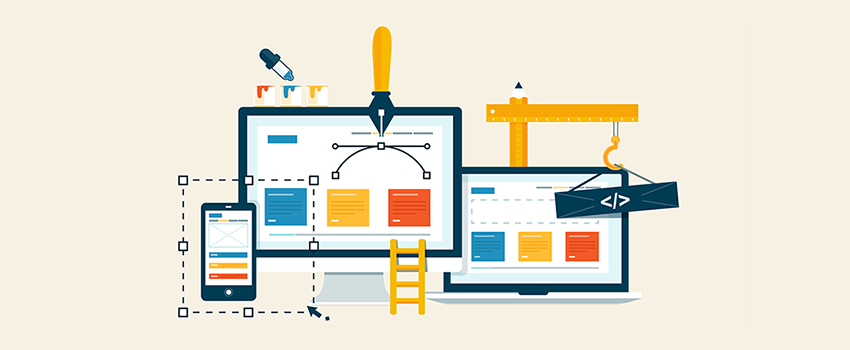
Gone are the days when people accessed your website just on the desktop. This is fast-paced technology era and people use a different device to access your website. So, except for the best desktop website, it’s imperative that you also have a responsive website. To make a responsive website, obviously, you need responsive web design tools.
There are so many responsive web design tools out there. Smart mobile phones are the latest trends in these days. Due to the growth of mobile phones and tablets, you need a responsive web design to expand your business over the world. Here are some essential tools for creating the perfect responsive website.
-
Gridset
Web designers and developers use this tool to make responsive and custom based grid layouts. It does not matter which type of content management system you use, it works on every CMS such as Joomla, WordPress and Drupal. With Gridset, you can build grids for all forms, columnar and many more.
-
Wirefy
Wirefy is an incredible tool to create fast and manageable wire frames. To use this tool, you should have knowledge of CSS and HTML. If you know about CSS and HTML language, you can easily generate wire frames without anyone’s help.
-
Adobe Edge Inspect
If you are worried about how your web page would look on different devices, Adobe Edge Inspect helps you check your site. This tool allows you to preview the project before the launch. You can see your design will appear on different smartphones including iPhone, Android, Windows and other devices like tablets.
-
Bootstrap
Bootstrap is most popular and important tool. Jacob Thornton and Mark Otto developed this tool to make front end web development. It has the best set of UI interface elements and Javascript tools. You can download this tool online without paying any money.
-
Invision
This app allows a developer to communicate the design transitions between screens to other members of the team. It also allows them to download working designs. The most important benefit of this tool is developers can send clickable design to your mobile via a simple message.
-
UxPin
This is an extremely important tool for responsive web design. It is a collaborative online design tool and also a design app. It allows developers and designers to make wire frames and prototypes. This is an incredible tool that create wire frames fast.
There are so many responsive web design tools and these are just few of them. Hope, these tools prove helpful to you when you build your WP responsive website so your users will get the best browsing experience. For more queries, do get in touch with our WordPress web designers in Toronto.